INTRODUCTION TO MATLAB
Chapter 13
Fast Fourier Transform (FFT)
13.1 Fourier Analysis
Suppose that you went to a Junior High band concert with a digital recorder
and made a
recording of Mary Had a Little Lamb. Your ear told you that were a whole lot of
different
frequencies all piled on top of each other, but perhaps you would like to know
exactly what
they were. You could display the signal on an oscilloscope, but all you would
see is a bunch
of wiggles. What you really want is the spectrum: a plot of sound amplitude vs.
frequency.
If this is what you want, Matlab can give it to you with the fft command.
13.2 Matlab's FFT
Your recorder stores the data in digital form, with numerical signal values
at equally spaced
time intervals. Matlab will read such data les in several formats, but the
simplest to
understand would just be a text le with two columns, one for time t and one for
the signal
f(t). Or perhaps it could just be the signal in one column and you know what the
time
step
 is because you know the sampling rate.
If the 2-column le were called signal.txt and if it had
two columns Matlab would
read it this way:
load signal.txt;
% the data is now stored in the variable signal as an Nx2 matrix
% unpack it into t and f(t) arrays
t=signal(:,1);
tau=t(2)-t(1);
f=signal(:,2);
Or, if the le only contains one column of data and you
know the interval between the data
points, then Matlab would read it this way
load signal.txt;
f=signal;
N=length(f);
tau=.001; % tau is the time interval between the points in f
t=0:tau:(N-1)*tau;
Now you have a series of data points (tj , fj) equally
spaced in time by time interval
 and there are N of them covering a total time from t = 0 to

The Matlab function fft will convert the array f(t) into an array g(ω) of
amplitude vs.
frequency, like this
g=fft(f);
If you look at the array g you will find that it is full
of complex numbers . It is complex
because it stores the phase relationship between frequency components as well as
amplitude
information, just like the Fourier transform of mathematical analysis. If you
wanted to
reconstruct the original time series by adding the frequency components back
together, you
can use the Matlab function ifft (inverse fft)
f=ifft(g);
similar to the inverse Fourier transform of mathematical
analysis. When we don't care
about the phase information contained in the spectrum g(ω), we can work instead
with the
so-called power spectrum P(ω), obtained this way:
P=abs(g).^2
To plot P or g vs. frequency, we need to associate a
frequency with each element of
the array (just like we had to associate a time with each element of f). Before
doing so,
however, it would probably be good to remind ourselves of the two types of
frequencies:
"regular" frequency (measured in Hz, or cycles/second) which we'll denote by v,
and angular
frequency
 (measured in radians/second). Both flavors of frequency are commonly
used, and you should make sure that you clearly understand which one you are
using in a
given problem.
We can find the frequencies associated the elements of the
array g by analysis of the
formulas Matlab uses to compute the fft and the ifft:

where tj gives the time for the jth element of f and !j give the frequency for
the jth element
of g. Using
 the fft equation, the exponent becomes
 This form
allows us to identify the components in the frequency array as

The frequency interval from one point in g to the next is then given by

The lowest frequency is 0 and the highest frequency in the array is

The frequency array v (in cycles per second) and the ! array (in radians per
second) would
be built this way:
N=length(f);
% build v (regular frequency, cycles/sec)
dv=1/(N*tau);
v=0:dv:1/tau-dv;
% build w (angular frequency, radians/sec)
dw=2*pi/(N*tau);
w=0:dw:2*pi/tau-dw;
An important thing to notice from the definition (13.2) of
the frequency step size
 is
is
that if you want to distinguish between two frequencies ω1 and ω2 in a
spectrum, then you
must have
 You can refine this resolution in frequency by choosing a large
value for the length of the time series,
 In addition, from Eq. (13.3) we can see
that the maximum frequency you can detect is so
if you want to see high
frequencies you need a small time step . Since the time step often needs to be
tiny (so
that
 is big enough), and data the taking time
 often needs to be long (so that

is small enough) you usually just need lots and lots of points, maybe even more
than your
computer memory will hold. So you need to design your data-taking carefully to
capture
the features you want to see without breaking your computer.
You will find that all data sets are not created equal
when fft is applied to them.
Sometimes fft will give you the answer really fast and sometimes it will be
slow. You can
make it run at optimum speed if you always give it data sets with 64, 128, 1024,
16384,
etc. (powers of 2) data points in them. (Use help fft to see how to give fft a
second
argument so powers of 2 are always used.)
Here is an example to show how this process works.
| Example 13.2a (ch13ex2a.m) % Example 13.2a (Physics 330) % Build a time series made up of 5 different
frequencies clear; close all; N=2^14; % Make a signal consisting of angular
frequencies % now take the fft and display the power
spectrum figure
%********************************************************* figure |

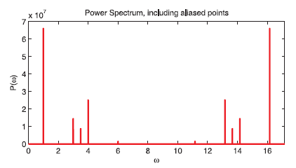
Figure 13.1 Plot of the power spectrum from Example 13.2a
The power spectrum in this example (Fig. 13.1) has peaks
at the ω's where they should
be, [1,3,3.5,4,6], but there are some extra peaks on the right side. These extra
peaks are
due to a phenomenon called aliasing, and it comes up all the time in FFTs so
we'll take a

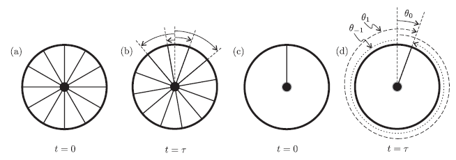
Figure 13.2 Aliasing results from sampling a signal at discrete time intervals.
The
ambiguity of the wheel rotation between (a) and (b) is due in part the the many
indistinguishable spokes. In (c) and (d) we can see that ambiguity still remains
with one spoke.
minute to discuss it in more detail.
13.3 Aliasing
If you have watched an old western movie, you may have noticed that
stagecoach wheels
sometimes appear to be turning backwards. This phenomenon is due to the fact
that movies
are made by taking a bunch of pictures separated by a defined time interval. We
know the
wheel rotates between pictures because the spokes are oriented at different
angles. But since
all the spokes look the same, there are many possible rotations that are
consistent with the
new spoke angles, as depicted in Figs. 13.2(a) and (b). By looking at the
figure, you should
be able to convince yourself that there are an infinite number of rotations
(both positive and
negative ) that are consistent with the spoke orientation in the two pictures.
This ambiguity
of frequency is referred to as aliasing, and it comes up whenever you study the
frequency
content of a signal that has been sampled at discrete times. Our brains
generally resolve the
ambiguity by picking the rotation with the smallest magnitude (whether the sign
is positive
or negative), which accounts for the stagecoach effect.
To get rid of complications due to the number of spokes in
a wheel, imagine that we
painted one of the spokes bright red, and then sampled its position at t = 0 and
t =
 as
as
shown in Figs. 13.2(c) and (d). The figure shows three of the possible angles
that the wheel
may have rotated through during this time interval:
 and
and

These angles of rotation correspond to three possible frequencies:

With some careful study, we can write down a general expression for all
frequencies that
are consistent with the wheel orientation at the two times:


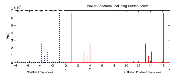
Figure 13.3 Plot of the power spectrum from Example 13.2a showing the negative
frequencies that are aliased as positive frequencies.
Here n is an integer, with n ≥ 0 corresponding to positive
frequencies and n < 0 corresponding
to negative frequencies . Notice that every frequency can be "aliased" by
neighbor
frequencies located
 above
or below the frequency of interest. If we recall from
Eq. (13.3) that
 is the width of the fft frequency window, we realize that any aliasing
we observe in the fft window comes from frequencies outside the frequency window
defined
by Eq. (13.3).
We can understand the extra peaks in Fig. 13.1 by noting
that the Fourier transform
of any real signal has an equal amount of positive and negative frequency
content, i.e.
P(ω) = P(-ω). Since our original frequency window included only positive
frequencies,
we didn't see the negative half of the spectrum. In Fig. 13.3 we've shown the
negative
frequency content of the signal from Example 13.2a in dashed lines , and the fft
power
spectrum in solid lines. Notice that each of the "extra" peaks on the right side
of the
spectrum are a result of an aliased negative-frequency peak located
 below the peak.
In the time domain, the negative frequency and its positive alias produce
signals that have
the same value at each sampling time, as shown in Fig. 13.4.
Since the aliased negative frequencies will always be
present in the fft window (for real
signals), we can only reliably detect frequency components with an absolute
value less than

This important limiting frequency is called the critical frequency or the
Nyquist frequency.
If the signal contains frequency components outside this range, the aliased
frequencies will
spill over into the positive frequencies and we will be unable to distinguish
between actual
and aliased frequency peaks. Thus, the highest frequency that you can see
without aliasing
trouble is vc (or ωc).

Figure 13.4 The cosine (left) and sine (right) of a negative frequency (dashed)
and its aliased positive frequency (solid). In our wagon wheel example, these
would
be
 and
and
 .
The dots indicate times at which the signal is sampled. There are
infinitely many other frequencies that also cross these sampled points, as
specified
by Eq. (13.5).
13.4 Using the FFT to Compute Fourier Transforms
If you just want to know where the peaks in a spectrum occur, you can take
the fft, lop o
the right half of the spectrum (after you have checked to make sure the aliased
frequencies
aren't spilling over), and plot the remainder as was done at the end of Example
13.2a. There
are many other uses for the fft, however. For instance, it is often useful to
numerically
calculate the Fourier transform of a signal, work on the spectrum in the
frequency domain,
and then transform back into the time domain. To make this easier, we need to
relate the
fft and ifft to the Fourier transform and its inverse:
Fourier transform :

Inverse Fourier transform :

We should warn you up front that these forms are not
universally used. For instance,
you can put a factor of 1/2π on one transform rather than a factor of
 on both.
Physicists frequently use the form in Eq. (13.7) because it makes an energy
conservation
theorem known as Parseval's theorem more transparent. Also, it is arbitrary
which equation
is called the transform and which is the inverse transform (i.e., you can switch
the minus
signs in the exponents). We prefer the convention shown, because the inverse
transform
can then be used to cleanly represent a sum of traveling waves of the form
 The
The
other sign convention is also mathematically permissible, and often used. You
should make
sure you clearly understand the conventions you are using, so you don't have
factors of 2π
floating around or time running backward in your models!
The fft and ifft functions in Eq. (13.1) are related to
the the forms in Eq. (13.7),
but there are several differences that need to be addressed: (1) The fft is a
sum with
no normalization, so the height of your peaks scales with N (the number of
points you
sample). (2) The fft has a negative exponent and (in our convention) the Fourier
transform
has a positive exponent. (3) The fft aliases negative frequency components to
positive
frequencies as discussed in the previous section. To address the first issue, we
just need
some judiciously multiplication by factors of N and 2π . The second issue can be
addressed
by using the ifft to calculate the Fourier transform and the fft to calculate
the inverse.
Finally, to address the aliasing issue, we take the aliased positive
frequencies, and put them
back where they belong as negative frequencies (Matlab uses the function
fftshift to do
this). When you want to take the inverse Fourier transform, you have to put the
negative
frequencies back where the Matlab functions expect them to be. When you put all
of this
together, it looks like this:
| Example 13.4a (ft.m)
% function to calculate the Fourier Transform of the
time series St fourtran = length(St)*fftshift(ifft(ifftshift(St)))*dt/sqrt(2*pi); |
| Example 13.4b (ift.m)
% function to calculate the inverse Fourier Transform
of the frequency series Sw invfourtran = fftshift(fft(ifftshift(Sw)))*dw/sqrt(2*pi); |
The nesting of functions in these these scripts is not
particularly intuitive (so don't spend
a lot of time working out the details of the shifting functions), but they get
the job done:
ft.m inputs a time series and a dt (i.e.
 )
and spits out a properly normalized (according
to our convention) Fourier transform with the negative frequencies at the
beginning of the
array; ift.m inputs a dω and a properly normalized frequency spectrum with the
negative
frequencies at the beginning of the array, and spits out its inverse Fourier
transform.
Since we put the negative frequencies at the beginning of
the series, the frequency series
that goes with the spectrum also needs to be fixed:
% Use this if N is even (usually the case since powers
of 2 are even)
w = -(N/2)*dw:dw:dw*(N/2-1)
% Use this if N is odd (puts w=0 in the right place)
w = -((N-1)/2)*dw:dw:dw*((N-1)/2);
To illustrate how to use these functions, lets use them to
analyze the same signal as in
Example 13.2a
| Example 13.4c (ch13ex4c.m)
% Example 13.4c (Physics 330)
%********************************************************* N=2^14; % Notice that the w array is different than
before % Make a signal consisting of angular
frequencies % Use our new function to calculate the fourier
transform figure % Now lets plot a normalized spectrum to
compare the relative heights figure |
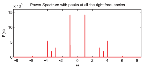
Now we have frequency peaks at all the right frequencies.
Also note that the peak heights
don't scale with N any more. The amplitude of peaks in a Fourier transform still
tends
to be large, however, because instead of amplitude, it is amplitude density
(amplitude per
unit frequency, or amplitude squared per unit frequency in the case of a power
spectrum).
So if the signal is confined to a tiny range in ω, its density will be huge.
The relative peak heights are similar to what they should
be, but zoom in closely
on the normalized power spectrum and you will see that they are not exactly the
right
size. (Power is proportional to amplitude squared, so the peaks should be in the
ratio
[1,0.25,0.16,0.49,0.04].) This is due to the discrete sampling nature of the
data in an fft.
To understand why the relative sizes are o , lets take the
Fourier transform of one of

Figure 13.5 Plot of the power spectrum from Example 13.4c
the frequency components in our signal analytically:

Yes, those are delta-functions located at ω = ±ω0, and
they are infinite (but they have finite
area.) So when Matlab does the fft on periodic data, the result is a bunch of
approximate
delta functions with very narrow widths and large amplitudes. However, since our
frequency
array doesn't have, for example, a point exactly at ω = 3 where our signal
should have a
delta function, the heights of the approximate delta function peaks are not
exactly correct.
Another way of stating this is that only if the total sampling time happens to
be an exact
multiple of the periods involved will you get correct amplitudes for periodic
signals. You can
get around this problem using a technique called windowing, where you artificially
confine
your signal in the time domain which makes your peaks broader in the frequency
domain.
With broader peaks the height isn't as sensitive to where your data points fall
in relation
to the exact center of the peaks.
We've only scratched the surface of what you can do with
numerical Fourier transforms,
but its time to move on. For more details see online help or Mastering Matlab 6,
Chapter 21.
| Prev | Next |