INTRODUCTION TO MATLAB
17.4 Making an EPS Suitable for Publication
The sizing commands in Example 17.3a fixed our scaling problem, but the
figure still needs
a lot of improvement before it would be suitable for a thesis or journal. For
instance, we
still need to fix the axes limits and put on labels. The lines are still sort of
"spidery," and
the x-axis is labeled with integers rather than fractions of π. We also need to
provide a
legend that tells what the lines and dots on this plot mean . In Example 17.4a we
show how
to address all of these issues by setting the visual properties of the objects
on the figure.
Run this example and then study the comments in it. The EPS output (made using
"Save
as") produced by this example is included as Fig. 17.3.
| Example 17.4a (ch17ex4a.m)
%Example 17.4a (Physics 330) x=0:0.05:2*pi; % Choose what size the final figure should be % Create a figure window of a specific size. % Set the lineseries visual properties. % Set the plot limits and put on labels % Get a handle to the axes and set the axes
visual properties % Put in a legend. We have to specify the font
back to Helvetica (default) % Set the output size for the figure. % Set the outside dimensions of the figure. % As a finishing touch, draw a proper rectangle
around the plot area |
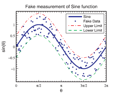
Figure 17.3 Plot made in Example 17.2b (no scaling).
Although the code is (of course) more complicated, it does
make a graph that 's suitable
for publication. The FontName business can be removed if you are not trying to
get symbols
as tick labels (unfortunately you can't use Matlab's TEX capabilities for tick
labels). You
may have also noticed that the example used the get command, which allows you to
read
the current value of a property from one of the objects that you are
controlling.
17.5 Subplots
In technical writing, it is often desirable to put multiple plots in the
same figure. The
command to produce plots like this is subplot , and the syntax is:
subplot (rows,columns,plot number)
This command splits a single figure window into an array
of subwindows, the array having
rows rows and columns columns. The last argument tells Matlab which one of the
windows
you are drawing in, numbered from plot number 1 in the upper left corner to plot
number
rows*columns in the lower right corner, just as printed English is read. See
online help for
more information on subplots.
You have probably already used subplot, but there are a
few tricks to controlling the
size and appearance of the exported figure for publication. Here is an example
of how to
produce a two -axis plot, formatted to t in a single column of a journal. Notice
that in
such a figure, there are multiple sets of axes, so it is important to be clear
which set you
are setting properties for. Figure 17.4 shows the plot produced by this script.
| Example 17.5a (ch17ex5a.m)
% Example 17.5a (Physics 330) % Make up some data to plot % Choose what size the entire final figure
should be % Create a figure window of a specific size. % Make the top frame: 2 rows, 1 column, 1st
axes % Make the plot--in this case, we'll just set
the lineseries % set the plot limits % Make the labels. % Get a handle to the top axes and set the
properties of this set of axes % Set this axis to take up the top half of the
figure % Now adjust the axes box position to make it
fit tightly % As a finishing touch, draw a proper rectangle
around the plot area % Create the second set of axes in this figure:
2 rows, 1 column, 2nd axes % Set labels for second axes % Set limits % Get a handle for the second axes. Note that
we are overwriting % Set this axis to take up the bottom half of
the figure % Now adjust the axes box position to make it
fit tightly % As a finishing touch, draw a proper rectangle
around the plot area |
17.6 Making Raster Versions of Figures
While EPS figures are great for printing, the predominant method for
presenting information
in a talk is with a computer projector, usually with something like PowerPoint.
Unfortunately, PowerPoint does a lousy job of rendering EPS les, so you may
prefer to
make a raster version of your figure to use in a presentation. In principle, you
can just do
this by changing output resolution in the "Export Setup" dialog and then
choosing a raster
format in the "Save as..." dialog. However, this can sometimes give mixed
results.
We have found better results by exporting via the Matlab
print command. (See Matlab
help for details on print.) To use this method, make sure to get a handle to the
figure
window when it is created using the
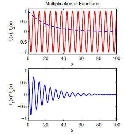
Figure 17.4 An example of a set of plots produced using subplot.
ff=figure
syntax. Then control the size and appearance as we
discussed above for making EPS figures.
Then once your figure looks right, you can use the following code:
set (ff,'PaperUnits',Units,...
'PaperSize', [figWidth figHeight],...
'PaperPosition', [0 0 figWidth figHeight]);
print -djpeg -r600 'Test.jpg'
to make a jpeg image with good resolution (600 dpi). This
code assumes you put the
size in the variables Units , figWidth, and figHeight as before. The raster
images that
Matlab produces sometimes get rendering oddities in them, and they don't do
anti-aliasing
to smooth the lines. This can sometimes be helped by increasing resolution or
changing
what rendering method Matlab uses (see the Renderer property in "Figure
Properties" in
Matlab help).
Another situation where raster graphics may be called for
is for 3-D surface plots with
lighting, etc. These are hard to render in vector graphics formats, so even in
when destined
for printing you may be better o making a raster figure le. Just control the
resolution as
shown in the example code above to make sure your printed versions look OK. (We
don't
recommend getting into the habit of doing this for print figures. Matlab's
vector rendering
engines usually do a better job than its raster rendering engines.)
| Prev | Next |