TI-83 Statistics & Regression
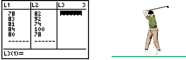
These are recent golf scores for Andy Taylor and Barney Fife:
| Andy |  |
| Barney |
To input statistical lists:
Hit the  key, then select
 : Edit under EDIT and
 .
.
(If there are already numbers in any list, arrow up to L1, L2, etc.; then hit
 and
and
to clear an entire column of numbers.
Another option is to use the
![]() : ClrList
: ClrList
command in the STAT EDIT menu followed by the name of the list.)
Enter elements in each list by typing the number and then
or use the arrow down
key. When you’ve entered one list, arrow right
 to start the next list.
Note: For regression analysis, the list of ordered pairs must have the same
size; if they’re
not the same size, the calculator gives a dimension error.
For Andy’s and Barney’s golf scores, the input might look like this :
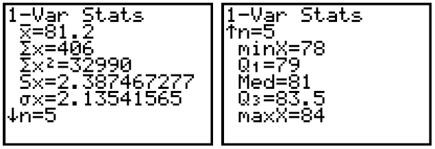
To perform one- variable statistical calculations:
Hit the key, then arrow once to the right to CALC, then hit
![]() : 1-Var Stats
and
: 1-Var Stats
and
. Type the appropriate list name (L1, L2, etc.), then hit
and the
calculator will perform several calculations nearly instantaneously.
The calculator finds the mean  , sum of the
data values
, sum of the
data values  , sum of the squares of
the data values  , sample standard deviation
 , population standard deviation
 , sample size [n], minimum value [minX], first quartile
 , median
[Med], third
, median
[Med], third
quartile  , and maximum value [maxX], in this order.
Note: The calculator can also handle 2-variable statistics, but this is
primarily used for
regression situations.
For Andy’s golf scores, the statistics would look like this:
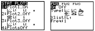
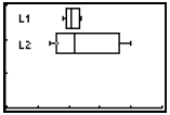
To make a statistical graph (box plot):
Using the golf data above (already stored in lists L1 and L2), the next step is
to hit 
 to enter the “STAT PLOT” menu. Hit
![]() to go into 1: Plot1, then choose the
to go into 1: Plot1, then choose the
settings you’ll see in the image to the right below.
 |
The other options are a scatter plot, a broken line graph , a histogram, a modified box plot, and a cumulative broken line graph. All are created using similar steps. |
With an appropriate window, we would then hit GRAPH to see
the box plot for Andy ’s
golf score. We’ll proceed in a similar fashion with Barney and show both graphs
together. We have L1 associated with Andy and L2 associated with Barney.
To request a second box plot, arrow to Plot2 and hit
![]() . Make similar
choices. Then
. Make similar
choices. Then
hit  , and enter the values you see in the chart below.
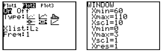
Both plots are on; the box plot options are selected; the
window is appropriate for the
data; and so we are ready to hit  .
.
 |
You’ll immediately recognize that Andy’s box is “tighter”, indicating greater consistency. His median is lower than Barney ’s, indicating better overall scores. (In golf, less is best!) |
Because of its importance in algebra , we’ll also focus on the scatter plot and regression.
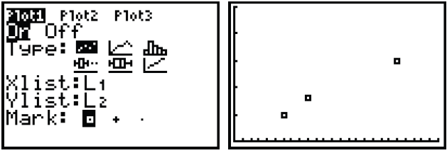
To make a statistical graph (scatter plot):
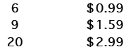
These are (possible) prices of chicken nuggets at a local restaurant.
| # of pieces | Price |
 |
|
Once the lists are entered into L1 (# of pieces) and L2
(price), hit  to enter the
STAT PLOT menu, then hit
![]() .
.
As before, turn the Plot On; select the statistical graph (the scatter plot is
the first option
next to Type); and check to see if your lists are matching up correctly with
Xlist and
Ylist. In this scenario, price clearly depends on the number of pieces in the
box, so the
Xlist (used for the independent variable) is L1 and the Ylist (typically used
for the
dependent variable) is L2.
When plot characteristics are set, you may enter
 (the statistical zoom)
to view a
(the statistical zoom)
to view a
scatter plot. The calculator automatically sets the window for you. You may also
enter
WINDOW to change the window settings [Xmin, Xmax, Xscl, Ymin, Ymax, Yscl], if
you wish. For this particular example, we suggest [0, 25, 1, 0, 5, 1]. Then hit
![]() .
.
For the chicken pieces pricing structure, the scatter plot request and graph
should look
like these:
Note: In a similar way, you can use the calculator to make
a broken line graph (suitable
for the chicken pieces and the Andy/Barney golf situations), and a histogram
(suitable for both data sets).
To perform regression analysis and graph a linear regression function:
Regression is a 5-step process.
1. Data entry (using ![]() EDIT, as described earlier)
EDIT, as described earlier)
2. Selecting and fine-tuning the scatter plot (using the
![]() STAT PLOT menu)
STAT PLOT menu)
3. Making appropriate ![]() settings (perhaps using
settings (perhaps using
![]() )
)
We assume that these first 3 steps are completed (with
images showing the process in
previous sections of this appendix). The fourth step is the big one!
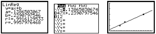
4. Hit ![]() , then arrow right t o CALC, then select
, then arrow right t o CALC, then select
 : LinReg(ax+b).
Since the data is in L1 and L2, enter 
In order to place the best-fit equation into Y1 automatically, hit
 , then
arrow
, then
arrow
right t o Y-VARS, hit
![]() (on Function), then hit
(on Function), then hit
![]() again (on Y1).
again (on Y1).
Another ![]() runs the regression calculations. The calculator will give the
values
runs the regression calculations. The calculator will give the
values
for a (slope of line) and b (y-intercept) for the line of best fit. If you press
Y=, you’ll
see the regression equation pasted in Y1. If Plot 1 is on, press
![]() to see
both the
to see
both the
line of best fit and the scatter plot.
Note: If your calculator doesn’t show the r2 or r values, hit
 and
scroll
and
scroll
down to turn “DiagnosticOn”. Then the calculator will find the constants for the
regression equation along with the correlation coefficient (r), r2 , or both
values,
depending on which regression function is involved.
For the chicken pieces pricing situation, the regression analysis yields these
results:
5. The next most important step is making predictions. Use
 to select the
“ASK” (Independent variable) and “AUTO” (Dependent variable) options. When you
go back into  , the table is blank. You input any X-value, and the
calculator
, the table is blank. You input any X-value, and the
calculator
will compute the corresponding Y value using the formula . The predicted prices
for
various numbers of nuggets are shown below, along with the decision.
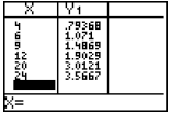 |
The linear regression equation suggests 79¢ for 4
pieces, $1.90 for 12 pieces, and $3.57 for 24 pieces. In each case, the restaurant would probably charge prices close to these values. Notice that the predictions for 6, 9, and 20 pieces are very close to the actual data values. |
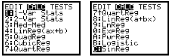
NOTE:
The calculator can also fit a parabola to the scatter plot (QuadReg), a cubic
function (CubicReg),
a quartic function (QuartReg), an exponential function (ExpReg), a logarithmic
function
(LnReg), a logistic function (Logistic), and a power function (PwrReg), and
these are
accomplished in a very similar manner. The particular regression equation forms
are given in
Section 5.1.
The format in each case is the regression type followed by
the Xlist, Ylist, and the Y-variable
location to paste your equation.
For example, the step 4 commands may be Logistic L1, L2, Y2 or ExpReg L1, L2, Y3
or another
similar command.
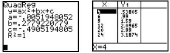
For example, using the QuadReg L1, L2, Y1 command, we find
that R2 = 1 , indicating a perfect
correlation between the variables (with the correlation coefficient R also equal
to 1 or –1). While
both the linear function and this quadratic function fit the scatter plot well,
by this r value, we
know the quadratic function fits better. It is also likely to predict better.
The quadratic function
gives the following predicted prices. Again, the company decides the price, but
these should be
very much in the neighborhood of what they would charge for the nuggets.
| Prev | Next |